English · PDF 474
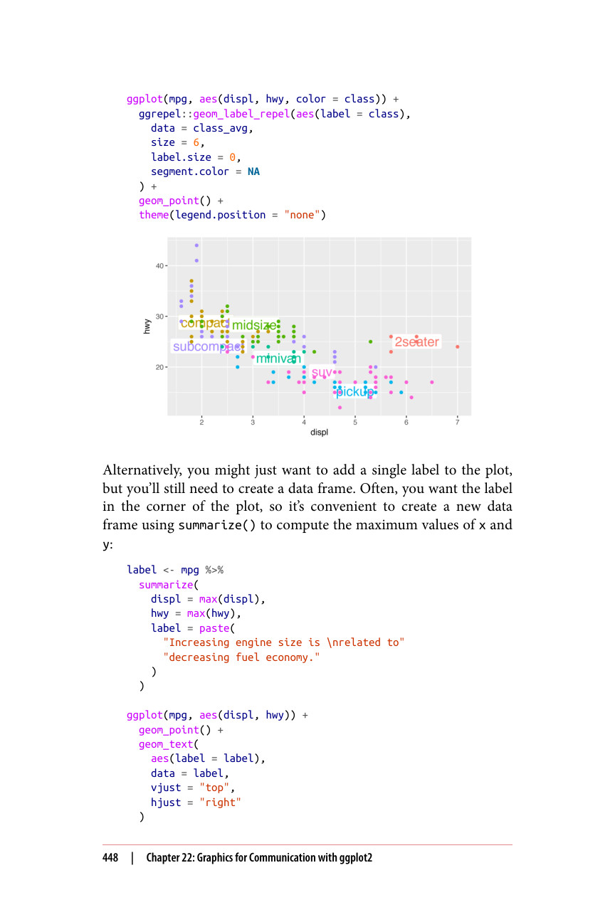
ggplot(mpg, aes(displ, hwy, color = class)) + ggrepel::geom_label_repel(aes(label = class), data = class_avg, size = 6, label.size = 0, segment.color = NA ) + geom_point() + theme(legend.position = "none")
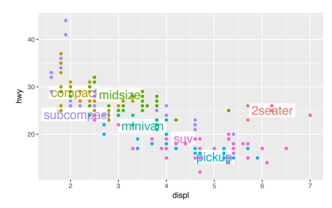
或者,你可能只想在图上添加一个标签,但你仍然需要创建一个数据框。通常,你希望标签位于图的角落,因此使用 summarize() 创建一个新数据框来计算 x 和 y 的最大值会很方便:
label <- mpg %>% summarize( displ = max(displ), hwy = max(hwy), label = paste( "Increasing engine size is \nrelated to" "decreasing fuel economy." ) ) ggplot(mpg, aes(displ, hwy)) + geom_point() + geom_text( aes(label = label), data = label, vjust = "top", hjust = "right" )