English · PDF 430
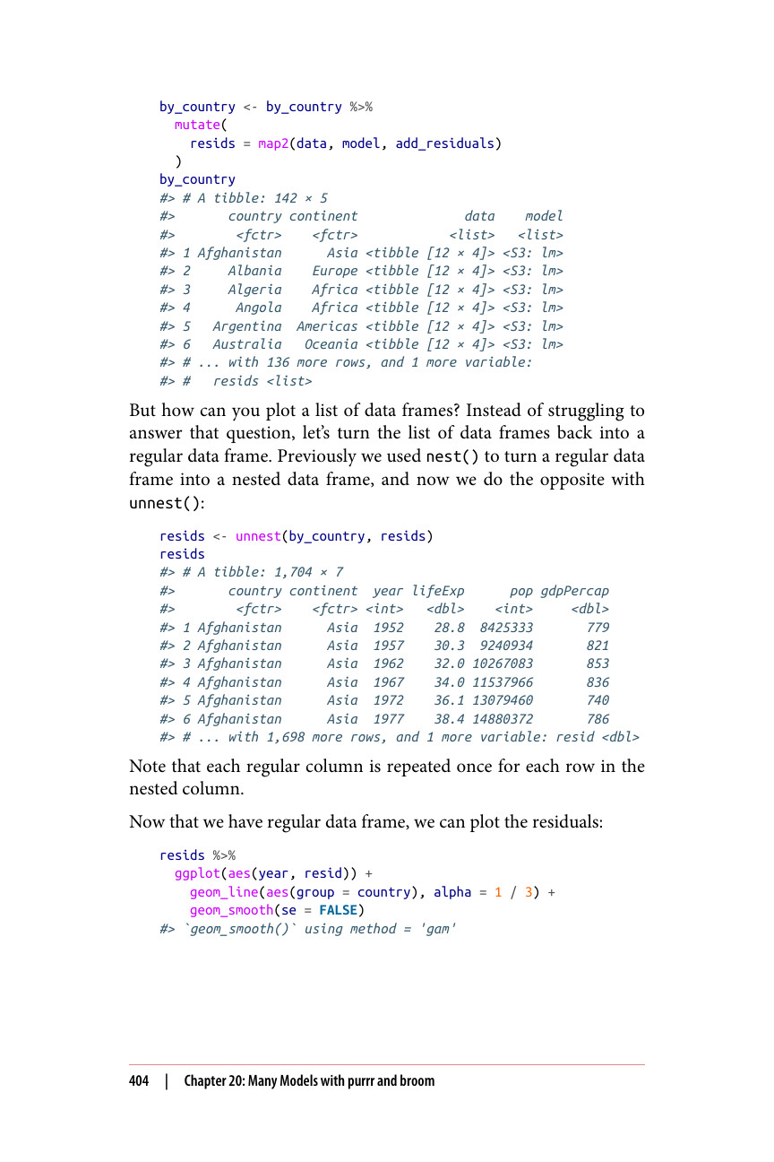
by_country <- by_country %>% mutate( resids = map2(data, model, add_residuals) ) by_country #> # A tibble: 142 × 5 #> country continent data model #>
#> 1 Afghanistan 亚洲 <tibble [12 × 4]> <S3: lm> #> 2 Albania 欧洲 <tibble [12 × 4]> <S3: lm> #> 3 Algeria 非洲 <tibble [12 × 4]> <S3: lm> #> 4 Angola 非洲 <tibble [12 × 4]> <S3: lm> #> 5 Argentina 美洲 <tibble [12 × 4]> <S3: lm> #> 6 Australia 大洋洲 <tibble [12 × 4]> <S3: lm> #> # ... 还有 136 行,以及 1 个变量: #> # resids
但是如何对一个数据框列表进行绘图呢?与其费力回答这个问题,不如让我们把这个数据框列表转换回普通数据框。之前我们使用 nest() 将普通数据框转换为嵌套数据框,现在我们用 unnest() 进行相反的操作:
resids <- unnest(by_country, resids) resids #> # A tibble: 1,704 × 7 #> country continent year lifeExp pop gdpPercap #>
注意,每个普通列会针对嵌套列中的每一行重复一次。
现在我们有了普通数据框,可以绘制残差图:
resids %>% ggplot(aes(year, resid)) + geom_line(aes(group = country), alpha = 1 / 3) + geom_smooth(se = FALSE) #> geom\_smooth() 使用 method = 'gam'